Hi everyone, I'll need to be really quick here as I'm on my lunch hour!
I'm a bit of a last minute Aggie with this card but I really wanted to enter the Less is More challenge. I'm really enjoying these challenges, they're fun to do but you have to do a bit of thinking and planning too.
Not sure this is what I set out to do but here it is anyway. The sentiment looks a bit weird but no matter what I did it didn't look straight!

I used :-
Image :- Hobby Arts.
Sentiment :- Hero Arts.
Colouring :- Promarkers, Sakura clear glitter gel pen.
Nesties and Cuttlebug embossing folder.
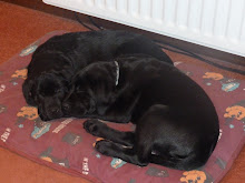
I think I should round up the dogs now and get back to work. Catch up with you all later.


A really lovely Less is More card Kat. Would really love to have a go at these but little time at mo, making Wedding invites. Have a lovely weekend. Carolxx
ReplyDeleteHi kaT
ReplyDeletei think maybe the sentiment could have gone a little higher, to bond the focal point of the centre square with it. For future you maybe try stamping the sentiment onto a piece of acetate or scrap the same size of the sentiment and holding in different position before you stamp
All in all a pleasing card
Thank you!
mandi
"Less is More"
Pretty card and super colors
ReplyDeleteKathyk
Lovely card! xx
ReplyDeleteI really like this card Kat, I think the way you angled the squares is great and I love the font of the sentiment, it looks ok to me but I do see what Mandi is saying. I am not trying to be on the fence, I really like their honesty in saying what they think, it's such a refreshing change from the same, same "lovely" card comments we can get....
ReplyDeleteI would be VERY PLEASED to receive this card...I think it's so hard to make CAS designs just right...
Take care for now
x
Vicky
A lovely fresh card Kat love the colours.xx
ReplyDeleteJust lovely Kat ~ love image and the layout too :o)
ReplyDeletehugs Vicky xx
Gorgeous card hun - was the sentiment a clear stamp? I only ask coz I get wobbles in mine too (can't stick 'em on the block straight to save my life). Sorry I've not been around much this past couple of weeks - having a 'mare with work. Will try to do better! Hope you are ok. Hugs, Sxx
ReplyDeleteGreat card Kat, love the pretty flower and layout :o) Lisa x
ReplyDeleteSo elegant, I love the colours you have used. xx Jan
ReplyDeleteSuch a pretty "neat" card
ReplyDeleteIt looks to me as though the sentiment has slipped on the wooden block and is no longer straight! Take a look and see.
ReplyDeleteAs Mandi said, do use the acetate technique to check the placement of your sentiment. It really works. Look back for a tip in Week 1.
This is a super card however, and we are delighted that you could join us. See you next week
Chrissie
"Less is More"
oh really really love this hun,the image and the embossed squares are just perfect its just so elegant,hugs cheryl xxxx
ReplyDelete